What's new?
Before:

After:

Now the block’s Structure can be set up separately from its Background. As before, the Structure consists of:
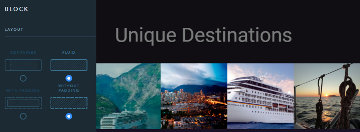
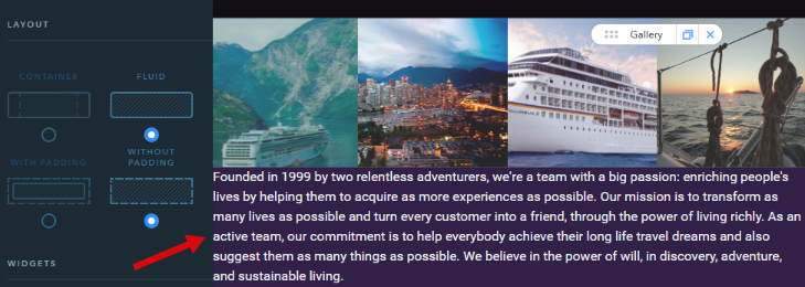
1. Elements within the block sticking to the screen edges
Tip: Fluid blocks are good for sliders and galleries. But it’s not recommended to fill this kind of blocks with big texts, it doesn’t look beautiful.
Good example:
Bad example:
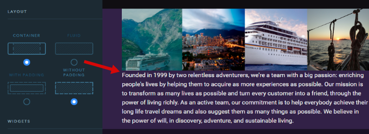
2. Padding settings between the elements
Tip: It’s ok not to use paddings if you place images or cards next to each other. But it’s no good to use a block without paddings if it contains text elements.
Good example:

Bad example:
What else has been changed?
The Background settings now look like this:

Not much, but the list will be extended in the near future :)
We’ve also added a new Color Overlay option for the background. Before, if you configured an image as a block’s background, you might have gotten the following:

Not really readable, right? With the new option you can make it look like this:
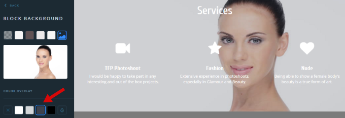
In the Overlay settings, you can choose from 4 pre-configured color options (to avoid garish and awkward combinations) or set a custom one:
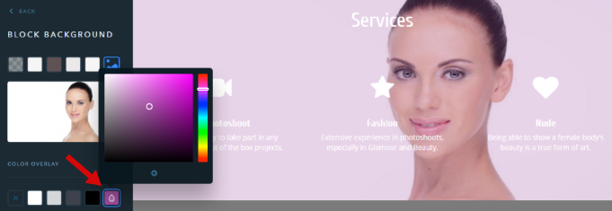
The rest of the settings on the left menu stayed unchanged and belong to the background image and its animation.
A word to the wise — don’t go overboard with parallax. See you soon! :)
