Map as a Block Background
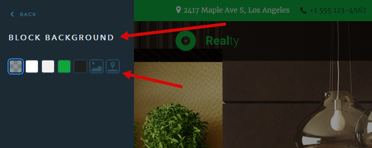
Continuing to work hard on the block’s functionality for uKit websites, we’re happy to add a new option — configuring a map as a background. You can tag places just as you normally do it with the Map widget. This kind of background will let you create eye-catching blocks with the contact details or just serve as a beautiful base layer. Here’s how you navigate to this option in the Builder:

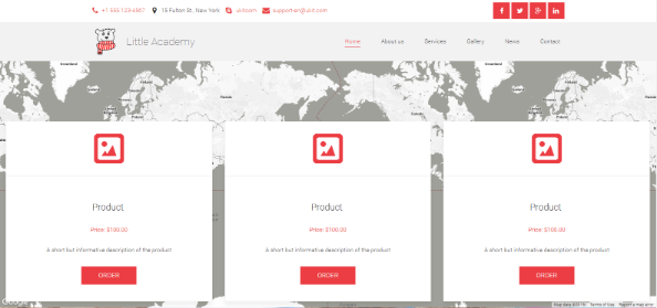
And here is how it will look on your website:

Color Overlay for the Map
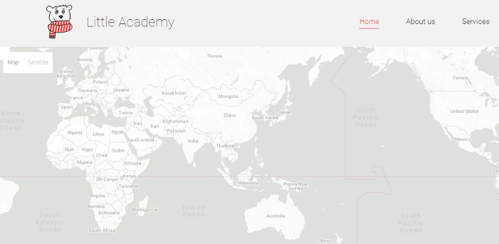
You talked, we listened. Available for any type of maps. An overlay with a minimum percentage of opacity will help you style the widget to match the overall look and feel of the website, while a non-transparent overlay (maximum percentage) will be most useful when setting a map as a block background, guaranteeing the text readability.

Map Markers — All Visible
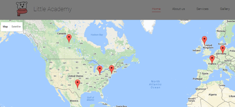
Every now and then it happens so that the tags are scattered all over the map and far beyond. We’ve taken care of it, so now the map automatically scales itself to display all the markers to provide the best visual experience for the site users. When viewed on different screen sizes and devices, the system adapts to gather everything in one place so that the user sees all the tags.

