
To make it easier for you to access this new feature, we've added the switch icon to the start screen of the Builder, so it’s well visible:

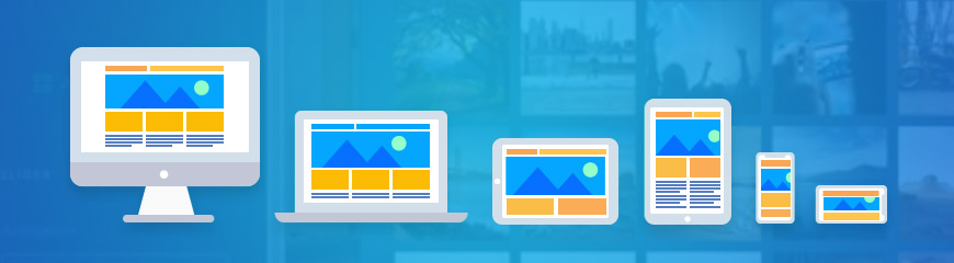
Once you click on the icon, you’ll be offered several site editing options — configure the desktop, tablet or mobile version:
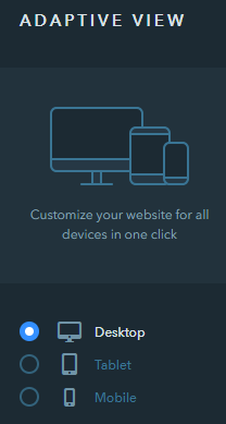
Editing Options
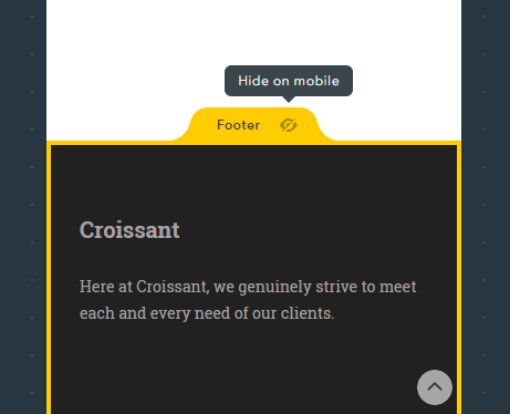
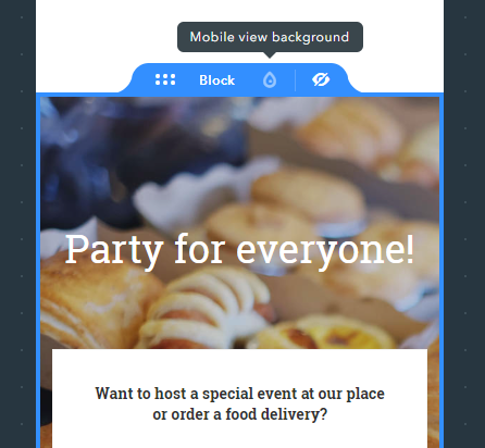
If you believe that some block looks off when viewed on smartphones or tablets, or vice versa — it’s not needed when people access your site from the PC, it can be hidden for a specific site version:
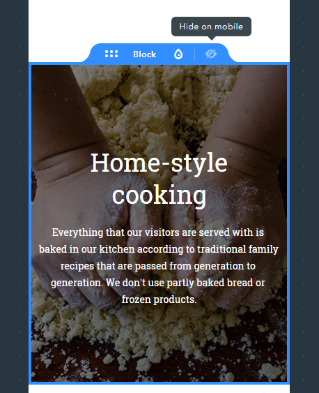
You can hide not only blocks but the header and footer too:
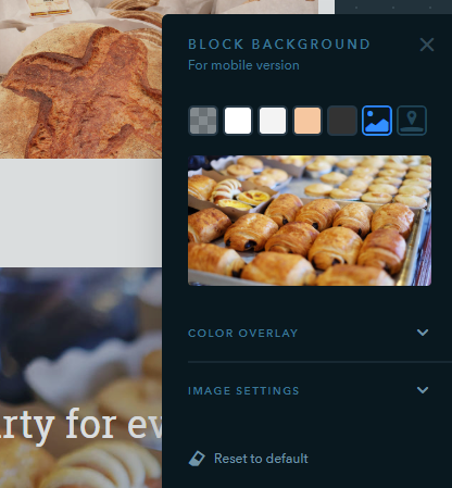
Block backgrounds can also be set up to adapt depending on the device type your site is accessed from:
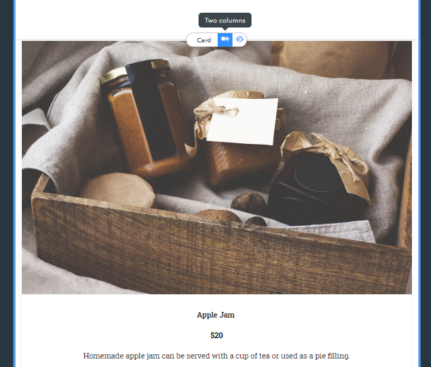
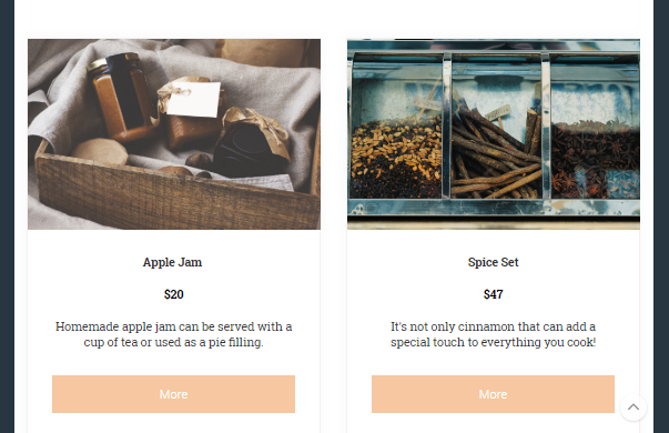
Last but not least, now there’s an opportunity to configure the position of widgets so that they are divided into 2 columns in the tablet view:
Inherited Desktop Background
 An important peculiarity of this update is that the design of the mobile version is synchronized with the primary (desktop) site version. Please note: The block background settings for desktop are synced with the mobile view until you make individual changes to the latter. As soon as you activate the settings specific only for the mobile viewing, your mobile version becomes independent and loses synchronization with desktop block backgrounds.
This logic doesn’t apply to the changes you make to the content of widgets. The content will be automatically synchronized across versions every time you publish your website.
Have Questions or Suggestions?
Feel free to leave comments about features that you’d like to see added in terms of mobile view settings!
Your comment