

Graphics optimization works for Image, Slider, Gallery, Card and Reviews widgets.
Optimization steps in when you get photos of 6MB and more from the camera and upload them to your website. But you will be able to feel a considerable effect of this update even for pictures taken with a smartphone and having a size of 2 megabytes. For those of you who used small, light images on websites this improvement won’t be that noticeable, of course.
How It Works
When you publish (re-publish) your website, for each image you upload a set of minified, resized copies is created according to the number of Bootstrap columns on any given website: from 2 to 4. When a website loads, visitors see only the copy that fits the current width of their browser window. If they try to change the browser’s width (e.g. tilt the tablet sideways), another version of the image instantly loads to suit this new width. That being said, the old images get cached, that’s why the transitions from 2 to 4 columns and back don’t require the page to reload.
We have applied the top loading algorithms of Progressive JPEG and Progressive PNG to all images that you can upload to your website. Thanks to these progressive loading techniques, visitors to your website can see the whole image straight away, as opposed to the usual way images load, which is gradually from the top to bottom, line by line.
See It in Action
Who uses the “heavyweight” graphics more than anyone else? Of course, photographers. And we see the reason behind it very well :) So, as an example website we took a photographer’s portfolio. And here are the results we received in terms of applying image optimization to it:
BEFORE:
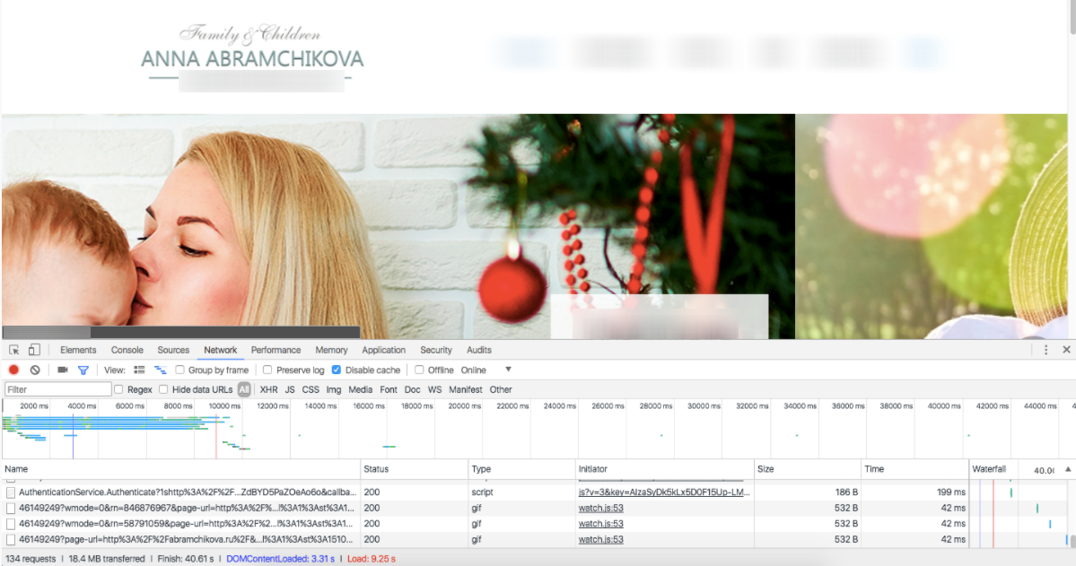
As we see, the load time is 9.25 s
AFTER:

And after image optimization it makes 4.24 s
The load time dropped by half! The amount of transmitted data decreased by 3.6 times!
Please note that the first publication that activates the website’s image optimization may take a while, since all user graphics undergo the resizing. But this is a one-time procedure. Further publications will happen quickly, as they normally do.
Impressed? Re-publish your website now to optimize your graphics!
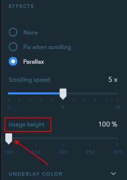
Updated Parallax Effect!
The old parallax on uKit websites used to work with glitches from time to time. This was caused by the library that was in use. So it was replaced with the new one — Rellax. As a result, the parallax effect has become seamless and smooth. And it works great on mobile devices as well.
In addition, a new setting was introduced — Image height, which allows adjusting the image to the website and align it with the desired parallax speed.
That’s all for today. Stay tuned, more updates are coming soon!
Your comment