
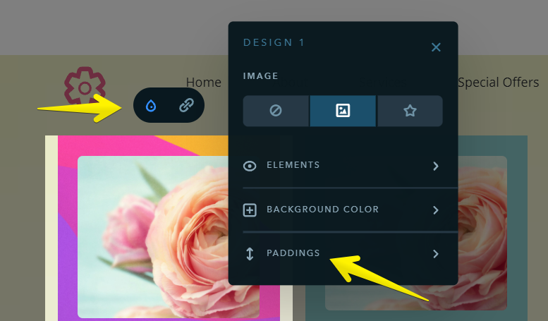
Paddings Settings
The new widget has a variety of settings, but one of the most interesting of them is the possibility to configure manually all the paddings, both outside the card and inside the card - between the elements.
If the paddings on all sides inside the card are supposed to be the same, you can set them up this way by changing just one digit in the settings. If you want the paddings to be different, change the values for all four sides — top, bottom, right, and left.
The paddings under the image (or icon) and under the text are set separately if needed.
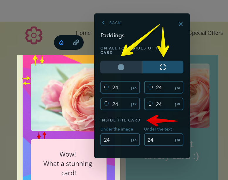
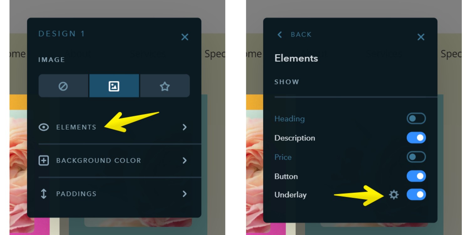
Wait, there's more about paddings! :) If the card has the underlay activated for the text and buttons, you can also set the padding values you want.
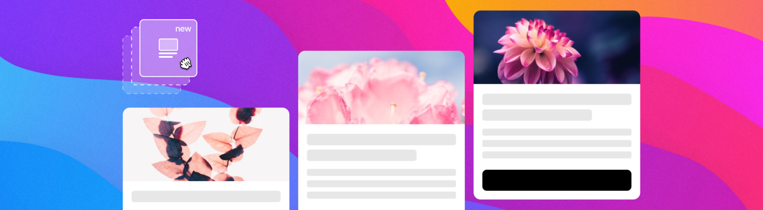
What Else Can Be Fine-Tuned
- Card image — disable or replace
- Card background — disable, set a color, or upload an image
- Card elements — heading, description, price, button, and underlay
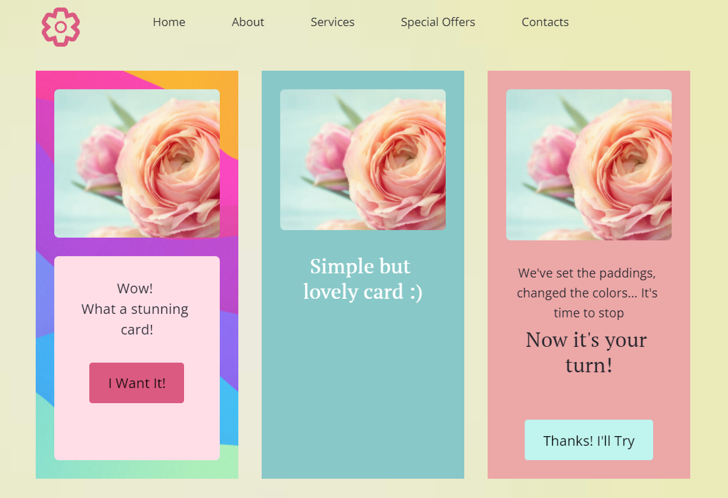
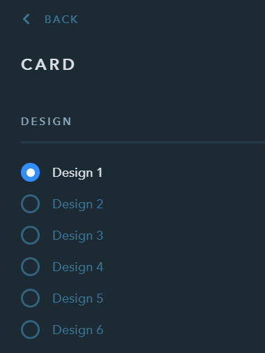
You can create and configure up to 6 different card designs for one site in uKit.
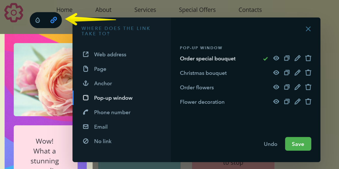
If you switch from the design settings (droplet icon) to the link settings, you can choose where the button will lead to in your card.
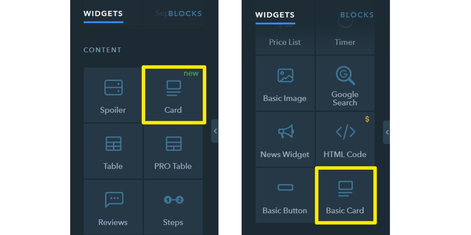
By the way, the old widget hasn't disappeared and is also available, but moved to the bottom of the Content widget section.
Contest Time!
It's been a while since we ran a contest, so we invite you to check out the new widget and come up with your own unique card design.
Send screenshots of your custom card (or links to the page where we can see it) in the comments below the blog article, or send them to our Facebook community.
We'll announce the contest results in a week — October 26. We'll select the three most interesting designs and extend the uKit plans for these users for 3 months!
Your comment